.
Y’all have asked and asked, so I finally got off my lazy butt and took some photos of my kitchen to show you. We have been in the house 4 months, so I still have lots of stuff to do, but I think kitchen is semi-presentable. I am IN.LOVE.with our kitchen. I mean, totally in love. When you design and build your own house, you can design it exactly how you want it. It took my husband about a year to draw the plan for our new house just to we would have everything just the way we wanted. Granted, I would have loved to have a craft room, a room just for barely used kitchen appliances and a room just for my shoes…but you know..money. Let me take you on a little tour of our kitchen… [rss-cut]
.
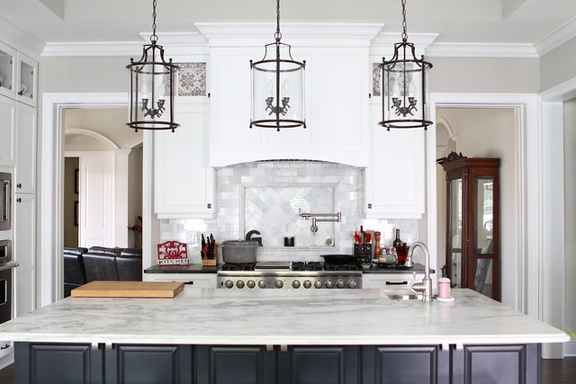
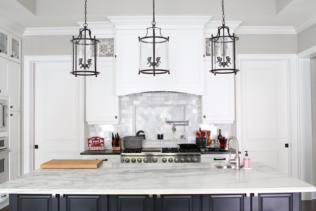
Here is the view from across the kitchen. We designed the kitchen with pocket doors, so when we are entertaining, the kitchen can be completely closed off from the main living room. Doors Open
.
.
Doors Closed
.
.
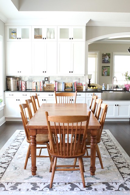
The kitchen is a true “EAT IN” kitchen with a large kitchen table that seats at least 8.
.
.
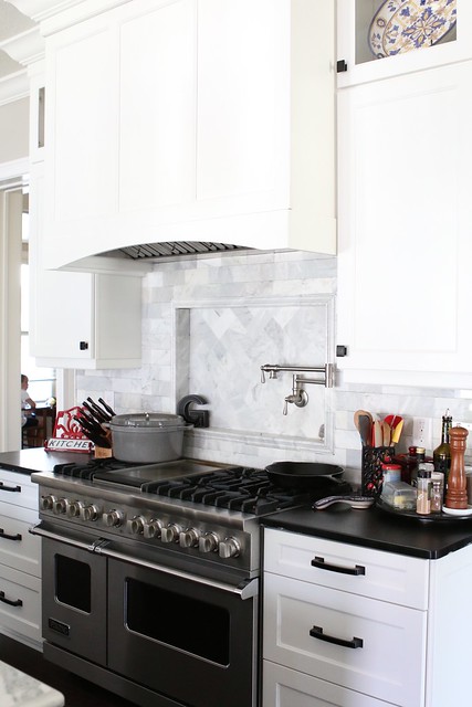
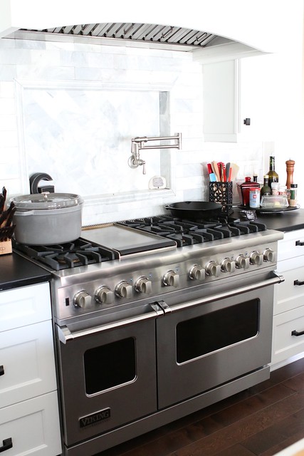
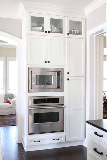
For as long as I have been cooking, I have dreamed of having professional style appliances…and I’m obsessed with them.
I choose the Viking 48″ Dual Fuel Range, wall oven and convection microwave.
.

.
.
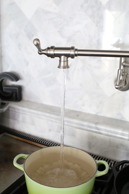
You know what else is amazing? A Pot filler. Some may call it lazy, but when you have to fill a pot that already weights 22 pounds empty with water…it sure is nice not have to move it from the sink to the stove!
.
.
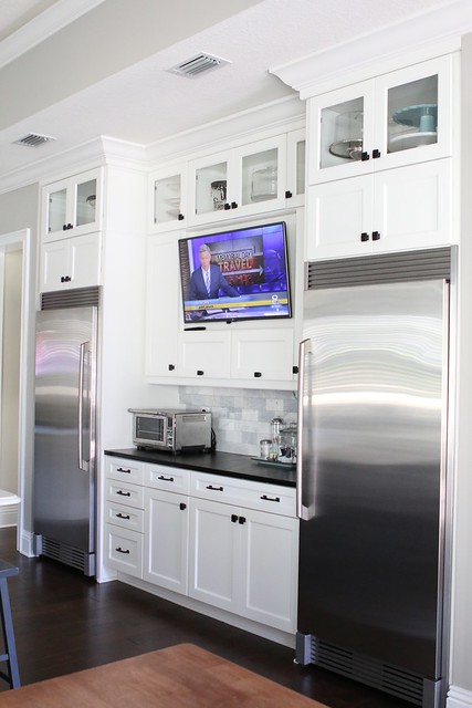
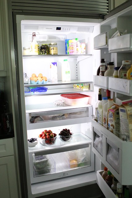
We opted for a separate fridge and freeze. One, because we love the way it looks and two, there is so much more space in them!
I would have been nice to get a Viking or Subzero, but those are like 50 billion dollars each, so I went with the more affordable Electrolux brand for the fridge and freezer. As you can see from the photo..I desperately need to go to the grocery store!
.
.
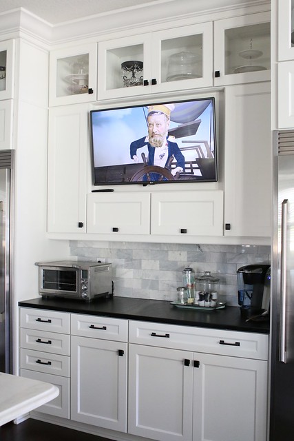
And my husband designed the kitchen with a TV, so I basically never leave the room.
.
.
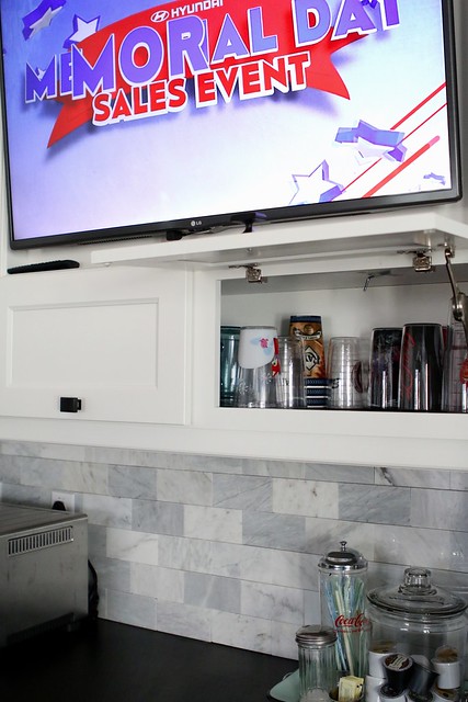
This whole area is designated for drinks and cups. The center cabinets under the TV lift up for easy cup access.
.
.
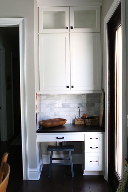
My little desk area is the perfect size. I fell if it were any bigger, I would just use the space to throw stuff and I HATE CLUTTER.
.
.
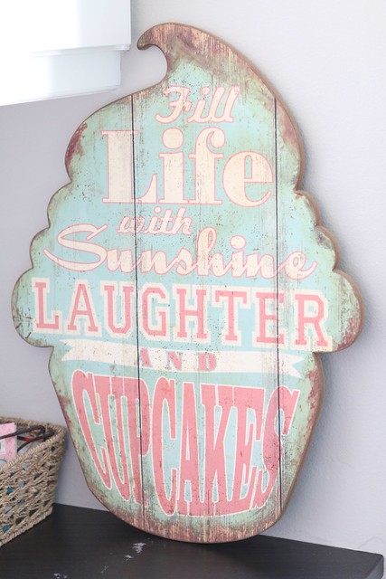
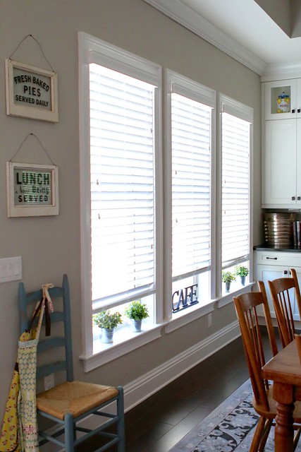
You will see little touches throughout the kitchen to make it more home-y…Like this cute cupcake sign and antique-y chair and pictures.
.
.
.
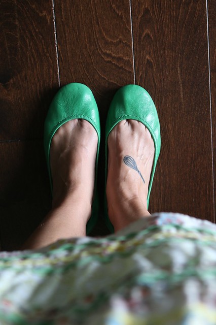
The dark wood floors are dreamy! I mean look how cute my Clover Green Tieks look against them?? While we are on the subject of Tieks..have you tried them??? They are seriously the only flat I can wear. I have horrendous plantar fasciitis which limits the type of shoes I can wear. Flats are a no-no for me. But the Tieks don’t make my feet scream and my feet don’t ache after wearing them for a day! They are leather which means the great and shape to your foot. I want a pair in every color!
.
.
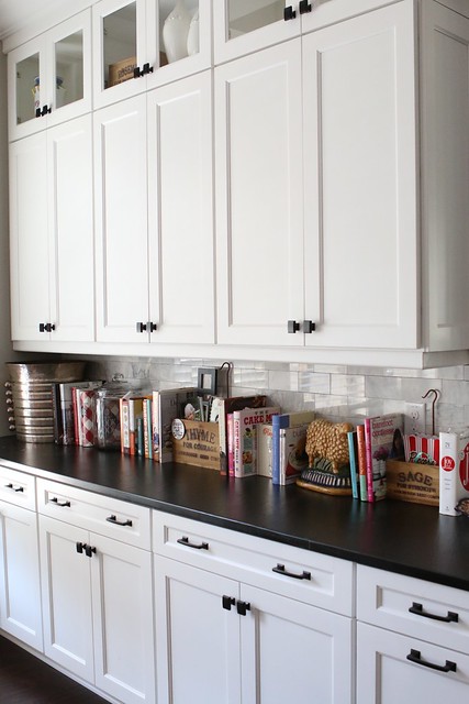
The opposite side of the kitchen has a long counter, that I decided to display “some” of my cookbooks.
.
.
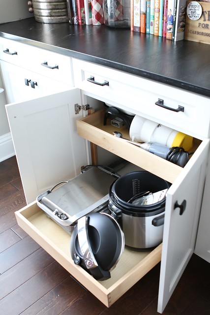
There are lots and lots of convenient pull out cabinets throughout the kitchen.
.
.
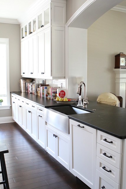
We decided on a big ol’ 36″ single bowl stainless steel farmhouse sink. White porcelain would have been pretty too, but I had a white sink before and I said NEVER AGAIN!
.
.
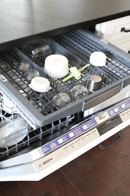
Let me tell you my Bosch dishwasher is the bomb. It has THREE, yes 3 racks. The top rack is perfect for ramekins and thinner items. 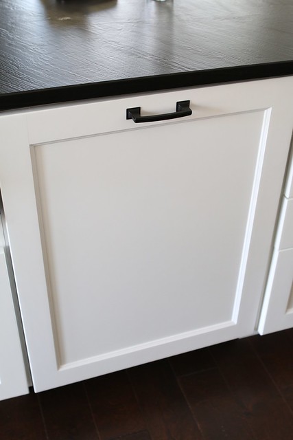
.
.
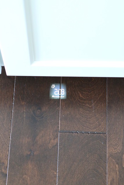
And it even displays the time remaining in the wash load on the floor. Sounds kinda silly, but you can’t even really hear the dishwasher running, so this feature is to prevent you from opening mid-cycle.
.
.
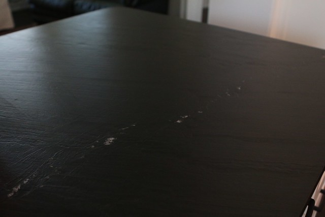
The black parameter countertops are soapstone and they contrast perfectly with the white cabinets. I adore them because they have a rustic feel. There is white veining throughout with a wavy matte finish.
.
.
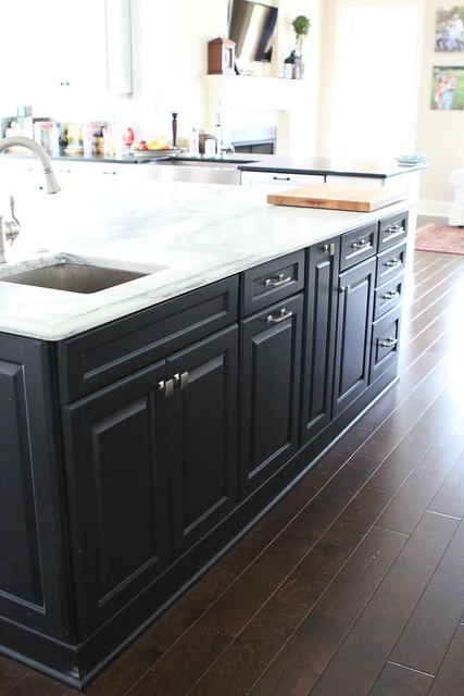
The center island is huge, measuring 8’4″ x 5′ 3″.
.

.
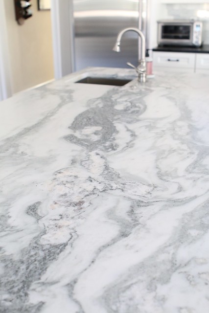
We choose marble for the top. I know some shy from marble in the kitchen, but I just couldn’t resist. The marble is Vermont Danby in Montclair. It is supposed to be a more “Kitchen friendly” variety. I think it’s stunning. The second I saw the slab, I know it was the one I had to have. There is also a smaller sink on the island for rinsing veggies and such.
.
.
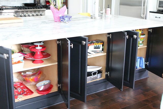
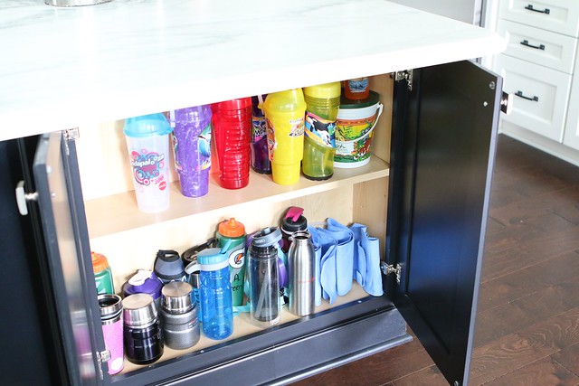
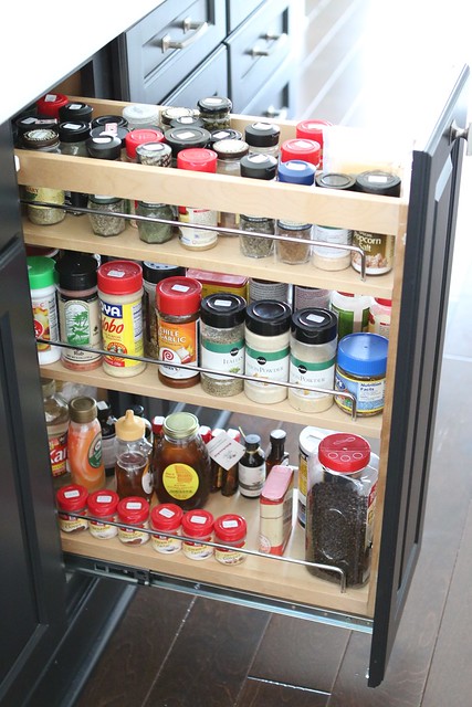
Having a big island means, lots and lots of storage..and the spice rack is super convenient too.
.
.
.
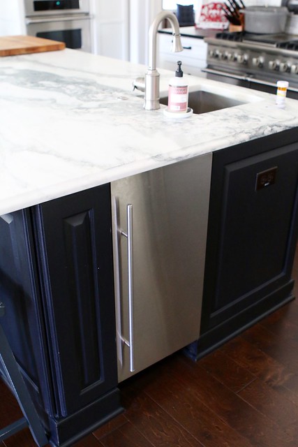
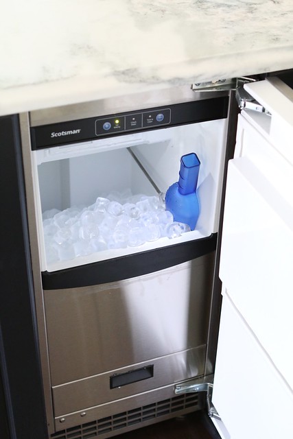
The island also houses the Scotsman Ice machine. Yeah, I know..an Ice machine right??? Well you see, at our old house, our ice machine worked perfectly, but my husband is an ice snob. He like his ice crystal clear, so the ice machine is really HIS toy.
.
.
.
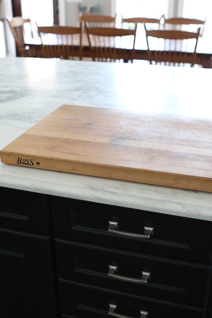
I keep this big John Boos cutting board right on the counter. It drove me crazy at first becasue I don’t like things on the counter, but having to move that heavy thing all the time would have driven me nuts.
.
.
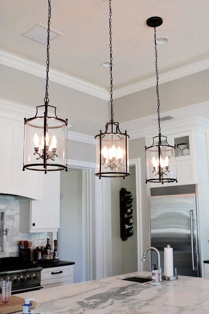
The lights about the island are my fav. I found them on ShadesOfLight.com
.
.
We obviously choose a black and white themed kitchen. We think it is a beautiful timeless look!
.
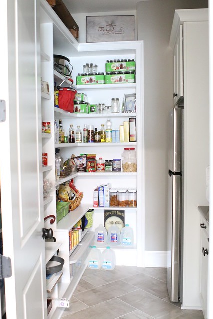
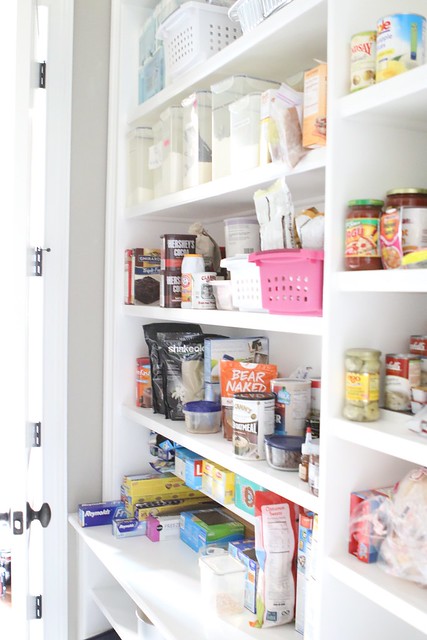
I think the pantry is an extension of the kitchen, so I let you peek in there too. It’s kinda messy and not very organized but I still love it.
.
.
It’s a nice walk in size with tall shelves and lots of storage with pull out cabinet drawers.
.
.
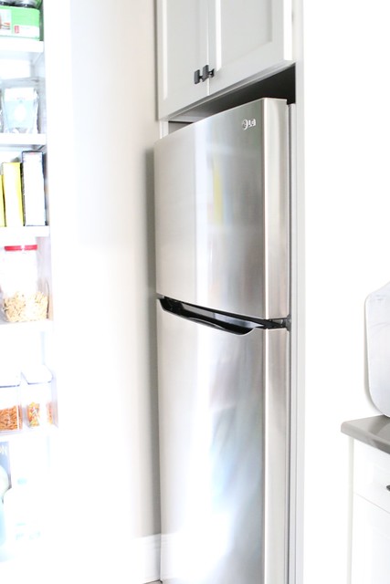
My husband designed it so we could put a fridge in the pantry. It’s the “drink fridge”. I think it’s perfect because the kids don’t keep opening and closing the main fridge for drinks where all the fresh food is making the inside temperature flucuate.
.
.
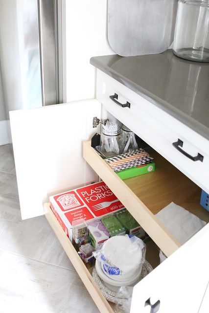
The pull out shelves in the cabinets are a must in the pantry too 😉
.
.
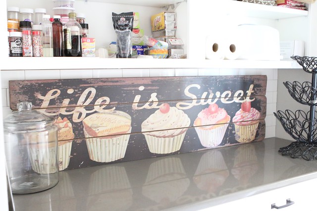
Again the are pops of antique with the “Life is Sweet” sign propped up against the backsplash.
.
I hoped you liked our kitchen tour! It was a labor of love.
Oh my goodness. That is the most amazing space I have ever seen. Young your husband should be extremely proud for all the thought you put into your kitchen.
Just beautiful!
Thank you Aubry.
BEYOND stunning!!!!
Thanks Liz! I love love love it!
Awesome! So many things to love. Like all of it. Especially love the extra fridge in the pantry. So smart because the kids drive me crazy constantly in the fridge. We have an extra one downstairs, but it’s such a pain to go down there. 😉 I would never leave that kitchen either.
Yes, I agree with you Katrina, I LOVE the drink fridge in the pantry!
Your kitchen is stunning! I wish we had more room to have a separate fridge & freezer. What a great idea! And your pantry…love! Your surfaces are just gorgeous! We just finished with our kitchen remodel and our taste is similar! We went with similar pendants, island (and storage within island), spice drawer… 🙂 I don’t blame you for not wanting to leave your kitchen. I feel the same.
Thanks for stopping by Chris. Doesn’t having a kitchen your in love with just make you happy! every-time I walk into mine, I just smile! Except when my kids leave stuff all over the table 😉 Ive been following your kitchen remodel in Instagram..I love it!
It’s beautiful! I wouldn’t even want to leave it either.
Thank you Barbara!
Absolutely gorgeous. You both did an awesome job.
Thanks Pamm. I am VERY pleased with the end result!
Oh my word! Can I come live with you! Your kitchen rocks! Love it! Nice work! Love us mama!
Come on over girl!
Oh my! What an amazing space. I would never want to leave either. I was waiting to see a cabinet with a pull out bed.lol . Enjoy making lots of memories in there.
Ill just sleep under the kitchen table. Thanks fr stopping by Laurie!
Girl your kitchen is stunning!! A dream come true for any cook! I’m in the process of designing my new kitchen which is a fraction of the size of yours but I will be doing white cabinets with grey/white granite. I’ll be consulting you for sure!!!
You can pick my brain anytime Katie!
Wow – simply stunning Leslie! Love, love, love your Viking stove and that cupcake sign is the cutest!
Thanks Lynda. I love my new space!
It is everything a gal would ever want!!! I absolutely LOVE it!!!
Karen. I tried to not leave a stone unturned!
WOW, WOW, WOW! So beautiful! You guys thought of everything.
Thank you Dawn.
I know you know what a lucky woman you are! The luxury of having a year to plan that perfect kitchen allowed you to do just that. It’s fabulous. You really did think of everything. Now I wanna see the rest of the house! LOL
Jana. I do feel extremely lucky. And to have such a creative husband to design it for me as well!!
Its beautiful and very comfortable at the same time!
All the best!
Yep, It sure is comfy! Thanks for stopping by Eva.
I think I’m in love! So well planned out. Love the pull out shelving, the different depths of shelving, the pop up cabinets…everything! Enjoy it, girl! Great seeing you today! 🙂
Thanks girl!!! Good seeing you today as well. I see coffee in our near future!
Thanks for sharing your amazing new kitchen with us. I love everything about it! You have incorporated so many wonderful ideas to make it functional and beautiful. I never knew you could get a pot filler.
Thanks for your kind words Pat! The pot filler is dreamy!
What??? Lucky girl – this is gorgeous! This is like my dream kitchen!!!!! 🙂
Its my dream kitchen too 🙂 I seriously spend 90 % of my time in here even when I am not cooking!
What a spectacular space. You did such a great job at planning everything. I am so glad you mentioned Tieks in your post. I have been looking at those and didn’t know if I wanted to spend the money. Great to know that even with your foot pain, you love the shoes!
Thanks you Marie! I love my new kitchen and YES the Tieks are dreamy! I never thought in a million years that I could go back to wearing flats. I love them.
What a gorgeous dream kitchen!!! Congrats on your new home!
Absolutely beautiful, I am so happy for you. Happy Cooking!
Amazing Leslie!! Wow wow wow! And love your whisk tattoo very cute!
Thanks girl!!!